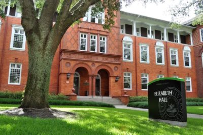
Photographing a Renaissance-era style photo shoot seemed daunting at first. With such a tight turnaround, the elaborate settings and outfits I was thinking of didn’t seem tangible. After some brainstorming with my fellow Reporter staff, we found a way to incorporate Stetson’s familiar settings with the dreamy Renaissance aesthetic. The solution? Elizabeth Hall.
As a history major, I spend a lot of my time in Elizabeth Hall. I’ve met my best friends in classes there, and I sometimes wonder about the people who walked the halls during the building’s early days and muse about their daily dramas. The Renaissance and Stetson aesthetics quickly melded into a story of beginnings and ends, but most importantly, companionship. So, this is my love letter to the friendships, old and new, found in Elizabeth Hall.
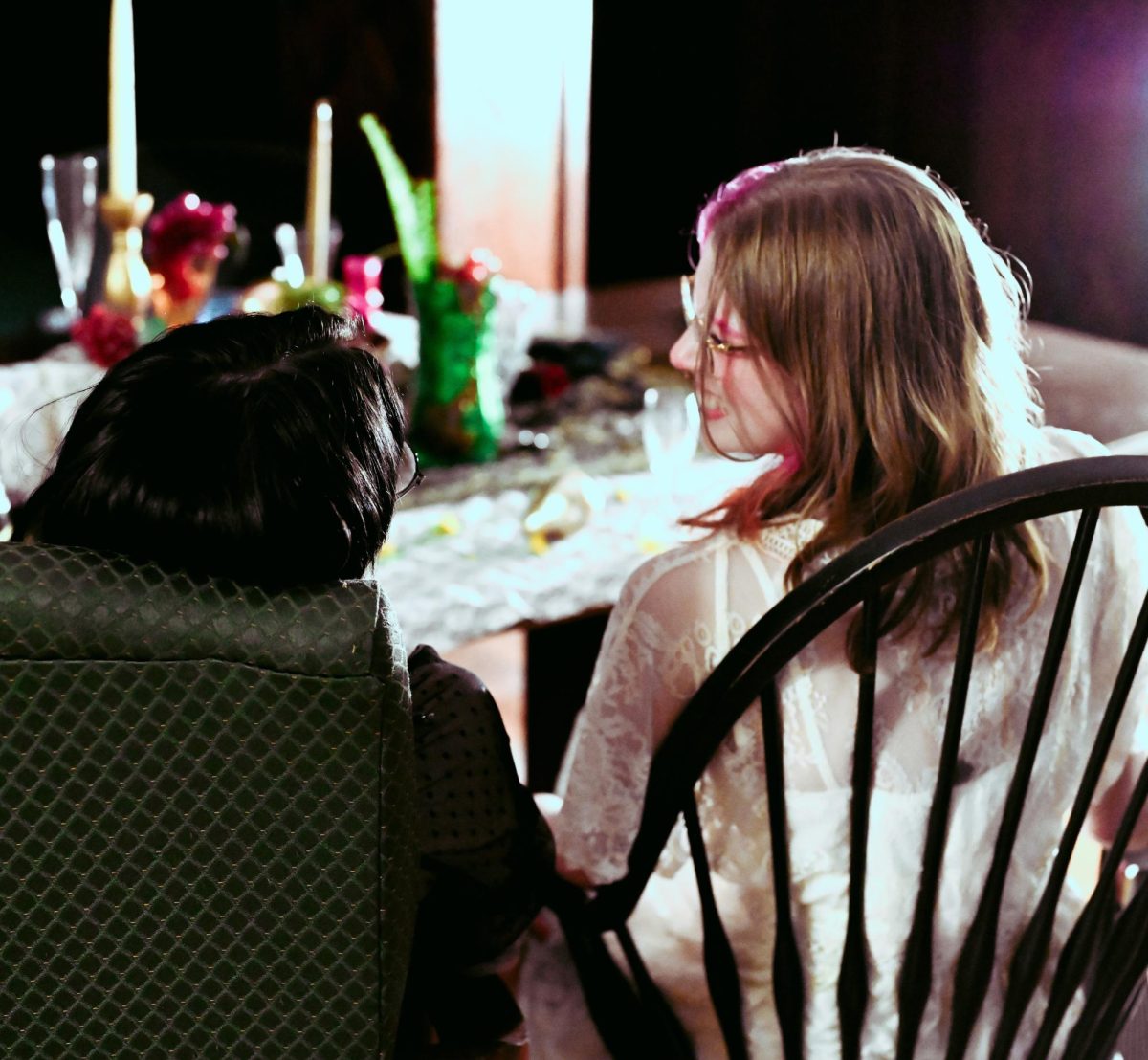
The photoshoot itself surprisingly went without a hitch. Managing Editor Carlye Mahler ’24 and Arts and Culture Editor Ciara Kelley ’24 were essential in finding the right props to set up our elaborate dinner scene. As the models trickled into the building’s main entrance on a Tuesday evening, so did other students – and everyone had fun watching the different reactions to our bizarre props and costumes.
I was a little vague to the models about what I expected them to wear on purpose because I wanted a mixed bag of aesthetics to contrast with one another. Luckily, everyone understood their assignment, and I was pleased to photograph Ciara wearing 1960s-style clothing next to other models, like Noureen Saaed ’24, in flowing white dresses.
In terms of lighting, we were confined to Elizabeth Hall’s dated fluorescent top lights and my personal desk lamp, which came in clutch to give the models a dreamy front-lit glow against the eerie main staircase and hallways.
The cover photo itself involved a lot of shuffling and a few “can you guys move in closer?” requests, but the somewhat exhaustive posing had a breathtaking outcome. Between the models’ makeup and the various props, the photo has a vibrance to accompany its dark, moody Renaissance origins. I was inspired by the photography genre “modern Renaissance,” which mimics the subtle chaos of actual Renaissance-era paintings. I instructed the models to look at different places and do different things, altogether forming a cohesive photo with interesting detail.
For some other scenes, we tried out different locations on the first floor, notably the women’s restroom. It was a little cramped with nine people crowding around the mirrors, but it resulted in some fun shots that communicate the camaraderie of the shoot. In a short side-track to the actual stalls, we experimented with the kookiness of Ciara Kelley’s Twiggy-inspired outfit to produce one of my favorite photos of the night.
Throughout the shoot, I enjoyed watching everyone bond over their shared interests in aesthetics and, for many of the models, their graduation this spring. Watching the models experiment with poses and work with one another was refreshing and definitely contributed to the easiness of the shoot. It was a joy to capture these moments, and I hope readers can see the love and effort that went into these photos and the magazine itself.


